Knowledge7

The Linux and Mobile Solution Provider

  • About
  • Training
  • Services
  • Clients
  • In the news
  • Blog
  • Contact Us
You are here: Home / Archives for Topic

The Internet and Digital Marketing

This topic is part of our Effective Digital Marketing training

20140718-digital-marketing

The Internet was invented in 1968 and, in the very beginning, was used mainly for email. In 1991, Tim Berners-Lee invented the World Wide Web as a means to disseminate information to a large number of people. As a matter of fact, he invented HTML, the Web Browser as well as the Web Server.

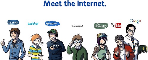
For many years, the Web was mostly one-way traffic until the introduction of Web 2.0 in 2005. Since then, we have seen the emergence of blogging, forums, wikis and, most importantly, social networks. Major social networks include Facebook, LinkedIn, Twitter, YouTube and Google+. Recently, new social networks have gained in importance, among them Instagram, Pinterest and Snapchat.

The move towards Digital Marketing

More and more people are spending a substantial amount of their time online, mainly on social networks. As such, in order to reach out to them for promoting products and services, it is essential for organisations to have a well-defined strategy to use these new digital tools.

In the beginning, organisations resorted mainly to what they knew well: mass advertising, mass emailing and one-way communication. This is what is known as Outbound Marketing and, even though, it can work, it is now generally accepted that there are better ways to reach out to potential customers.

Inbound Marketing is about maximising engagement and establishing authoritativeness. This is done by listening and creating compelling content which addresses the needs of people and sharing these content where people really spend their time. Statistics show that Inbound Marketing is much more effective than Outbound Marketing techniques.

Inbound Marketing is an interactive two-way conversation. Examples are regular posts on a website, podcasts, videos, white papers, case studies, etc. all shared through social media. The best way to convince a customer is to help him/her first.

Work to do

Check the following online resources and comment on them:

  • Internet World Stats for Mauritius
  • ICT Statistics Year 2013
  • How Much Is A User Worth?

20140812-meet-the-internet

This topic is part of our Effective Digital Marketing training

Our forthcoming training courses

  • No training courses are scheduled.

Alignment of Elements

This topic is part of our Web Design with HTML and CSS training

HTML elements are left-aligned by default, that is they begin at the left margin.
The CSS text-align property configures the alignment of text and inline elements within block elements such as headings, paragraphs and divs.
The values for the text-align property are left (default), center, right and justify.

The width property configures the width of an element’s content in the browser.
Be careful the width of an element displayed in the browser includes the width of the element’s content, padding, border and margin – it is not the same as the value of the width property, which only configures the width of the actual content.

The min-width property sets the minimum width of an element’s content in the browser.The minimum width value can prevent content jumping around when a browser is resized.

The max-width property sets the maximum width of an element’s content in the browser.The maximum width value can reduce the possibility ot text stretching across large expanses of the screen by a high-resolution monitor.

This topic is part of our Web Design with HTML and CSS training

Our forthcoming training courses

  • No training courses are scheduled.

Tables and Anchors

This topic is part of our Web Design with HTML and CSS training

Table

HTML table is an element comprised of table rows and columns like part of a spreadsheet. They are container elements holding HTML elements in a tabular fashion, row by row. HTML tables are only used to display tabular information but may also sometimes help is setting up the layout of a page.

A example of a table may be the following:

Header 1 Header 2
row 1, cell 1 row 1, cell 2
row 2, cell 1 row 2, cell 2

Important aspects of HTML table:

  • Table are defined within the <table> tag
  • Table rows are defined within the <tr> tag(table row)
  • <tr> may contain <td>(table data) or <th>(table header)
  • A Cell may span on several rows by setting the rowspan attribute
  • A Cell may span on several columns by setting the colspan attribute

For more information, refer to W3C documentation for table.

Anchor

Hyperlinks are how we move around on the web. In HTML, hyperlinks can be created using the <a> tag. The <a> tag can take several attributes among which href is the most important. Suppose, we want to create a link to the homepage of knowledge7.

<a href=”https://www.knowledge7.com”> Knowledge7</a>

will look like Knowledge7 when rendered on a browser.

Hyperlinks can be used to link to local web pages, external web pages or section within a page. An <a> tag can be in several states namely:

  • Link: The link has not yet been clicked
  • Active: The state which it being clicked and not yet released by the user
  • Visited: The state after it has already been visited
  • Hover: The state when the user’s cursor in on it

Check the latest rules set by W3C about anchors here

This topic is part of our Web Design with HTML and CSS training

Our forthcoming training courses

  • No training courses are scheduled.

Markup and Styling

This topic is part of our Web Design with HTML and CSS training

Learn HTML

HTML, which stands for HyperText Markup Language, is a markup language used to create web pages.HTML is not a programming language, but rather a markup language which allows you to define the layout and content of a HTML page. HTML Files are stored on Web Servers. Web Browser acts like client applications and request web pages from web servers. HTTP (Hypertext Transfer Protocol) is a protocol mostly by web browsers to request HTML files from web servers.

Basically an HTML document is a plain text file that contains text and nothing else.When a browser opens an HTML file, the browser will look for HTML codes in the text and use them to change the layout, insert images, or create links to other pages. Since HTML documents are just text files they can be written in even the simplest text editor. In our case, we are going to use gEdit to create HTML files and Google Chrome to render these files.

The most basic HTML File would look like this:


<!DOCTYPE html>
<html>
<body>
</body>
</html>

  • The DOCTYPE declaration defines the document type
  • The text betweenanddescribes the web page
  • The text betweenandis the visible page content

Tags are used to describe how you want a piece of text to be interpreted by the Web Browser. <title > defines the title of your browser window. Likewise, you have lots of HTML tags.

HTML allows you to define the layout and content of an HTML page while CSS(Cascading Style Sheets) describes how to display HTML elements.

This is a CSS rule:
CSS Selector

There are 3 levels of CSS.Styles are added to HTML elements is the following ascending order.

  1. External Styles
  2. Embedded Styles
  3. Internal Styles

The internal styles overrides all other styles. With CSS, you can format HTML elements in many different ways such as changing their font-size or color etc.

This topic is part of our Web Design with HTML and CSS training

Our forthcoming training courses

  • No training courses are scheduled.

CSS Box Model

This topic is part of our Web Design with HTML and CSS training

The box model is one of the fundamental concepts in CSS, it is used to configure the appearance of elements and the overall layout of documents.
It describes the way an element has the potential for a border, padding, and margin, and how the border, padding, and margin are applied.

The margin is the area outside of the element. It never has color; it is always transparent.
The border extends around the element, on the outer edge of any padding. The border can be of several types, widths, and colors.
The padding exists around the content and inherits the background color of the content area.
The content is surrounded by padding.

This topic is part of our Web Design with HTML and CSS training

Our forthcoming training courses

  • No training courses are scheduled.

Colors and Images

This topic is part of our Web Design with HTML and CSS training

Colors

Colors can greatly influence visitors. When choosing colors make sure they are used judiciously and with respect.

Best practices when using colors include:

  • Use a natural palette of colors.
    • using natural colors /avoid ultrabright colors .
  • Use a small color palette.
    • Focus on three or four main colors with a few complimentary colors, at the most.
  • Consider your demographics.
    • younger people and older people don’t have same preferences ,it applies same for men and women
    • people from different geographic regions and cultures.

Color schemes in Web design:

  • Analogous – Colors that are adjacent to each other on the color wheel, such as yellow and green.One color is the dominant color and its analogous friend is used to enrich the display.
  • Complementary – Colors that are opposite from each other on the color wheel, such as a warm color (red) and a cool color (green).
  • Triadic – Three colors that are equally spaced around the color wheel. The triadic scheme provides balance while still allowing rich color use.

Using hexadecimal colors

The hexadecimal color format is #rrggbb, in which rr, gg, and bb are two-digit hexadecimal values for the red (rr), green (gg), and blue (bb) components of the color.

If you’re not familiar with hexadecimal numbers, don’t sweat it. Just remember that FF is the maximum and 00 is the minimum.

Use one of the following codes for each component:

  • FF means full brightness.
  • CC means 80 percent brightness.
  • 99 means 60 percent brightness.
  • 66 means 40 percent brightness.
  • 33 means 20 percent brightness.
  • 00 means none of this color component.

For example, bright red is #FF0000, dark green is #003300, bluish-purple is #660099, and medium-gray is #999999.

Back in the day of eight-bit color it was very important to use web-safe colors. In fact, there are 16 colors listed in the W3C standards: aqua, black, blue, fuchsia, gray, green, lime, maroon, navy, olive,purple, red, silver, teal, white, and yellow. Obviously there are many more colors displayed on the Web than just those 16. Today, it is less important since most video drivers support millions of colors.

Images

“A picture says more than words”

Creating images for the Web is a bit different from creating images for output on paper. The three most widely used formats on the Web that can be viewed by current browsers are GIF, PNG and JPEG. Obviously you want to choose a format that gives you the best quality with the smallest file size.

One of the most effective ways to reduce the size of, and therefore the download time for, an image is to reduce the number of colors used in the image.
This can drastically reduce the visual quality of some photographic images, but it works great for most banners, buttons, and other icons.

Favorites Icon
Favorites icon, usually referred to as a favicon, is a square image (either 16X16 pixels or 32X32 pixels) associated with a web page. The favicon may display in the browser address bar, tab, or the favorites/bookmarks list. Favicon can be created a favicon in a graphics application, such as GIMP, or at a number of websites.

This topic is part of our Web Design with HTML and CSS training

Our forthcoming training courses

  • No training courses are scheduled.

Flexible Layouts and Printing

This topic is part of our Web Design with HTML and CSS training

Flexible Layouts

Depending on content, the navigation bar can be placed on top, left and right. However, when using a list for the navigation, remember the default value display of li is list-item.
For a horizontal navigation bar change the display property to display:inline
For left navigation, display will be block and float:left
Consequently for navigation on the right simply by float:right

Of course other alternative for ‘float’ is by using position relative or absolute.

Printing

There are nine possible output types:all, aural, braille, handheld, print, projection, screen, tty, and tv with varying degrees of support. Practically speaking, the ones likely ever used are screen, print and handheld.

The default value for media attribute is all, so declaring media=”all” is redundant.

Using Media-Specific Style Sheets
You can designate a style sheet to be used only for a particular output, perhaps only for printing or only for viewing on screen in the browser. For example, you might create one general style sheet with features common to both the print and screen versions, and then create individual print and screen style sheets with properties to be used only for print or screen, respectively.

To designate media-specific style sheets:
Add media=”output” to the link or style start tags, where output is one or more of the following: print, screen.

In the head section add :
<link rel=”stylesheet” href=”style.css” media=”screen” />
<link rel=”stylesheet” href=”print.css” media=”print” />

Where the style.css is used for display on computer screen and the print.css is used for printing.

For example, when printing you do not need the navigation you need to simply specify

nav {
display:none;
}

This topic is part of our Web Design with HTML and CSS training

Our forthcoming training courses

  • No training courses are scheduled.

Enhanced Navigation and Vendor Prefixes

This topic is part of our Web Design with HTML and CSS training


Understanding Vendor Prefixes
CSS3 has not yet reached the W3C’s Candidate Recommendation stage (which would mean that the specifications are complete), many parts have already been implemented in recent versions of Firefox, Internet Explorer, Chrome, Safari, and Opera.
In order to future-proof unfinished (and occasionally competing) CSS implementations that are subject to change, those that require it have been implemented in browsers using what are called vendor prefixes. These allow each browser to introduce its own support for a property without conflicting with the final specification or with other browsers. Additionally, vendor prefixes provide a way to ensure that, once a specification has matured or been finalized, existing Web sites using the experimental implementations do not break.

Each of the major browsers has its own prefix:

  • -webkit- Webkit/Safari/Chrome,
  • -moz- Firefox,
  • -ms- Internet Explorer,
  • -o- Opera, and
  • -khtml- Konqueror

Using CSS3, corners of most elements can be rounded by using the border-radius property, which requires using vendor prefixes to support older versions of Firefox and of Webkit-based browsers such as Chrome and Safari.

div
{
-moz-border-radius: 10px;
-webkit-border-radius: 10px;
border-radius: 10px;
}

The border-radius is used to round all corners of an element, however to round each corner use properties: border-top-left-radius, border-top-right-radius, border-bottom-right-radius, border-bottom-left-radius.

This topic is part of our Web Design with HTML and CSS training

Our forthcoming training courses

  • No training courses are scheduled.

Multimedia & Advanced CSS Techniques

This topic is part of our Web Design with HTML and CSS training

Multimedia

In the past, plugins such as Adobe Flash were needed for displaying video and audio. However, HTML5 now has native support for both video and audio. Audio and video in HTML5 are now how image are supported. HTML5 specifies some Codecs which are supported for Audio and Video. A Codec is simply a compression algorithm for converting video and audio into smaller file as well as maintaining quality.

Video Codecs in HTML5

  • Ogg Theora
  • mp4
  • webm

Audio Codecs in HTML5

  • Ogg Theora
  • mp4
  • mp3
  • wav
  • aac

To add a video, simply use <video> tag with the attributes src holding the link to the video like

<video src="path/to/videofile"></video>

The tag can also take other attributes such as:

  • controls="controls" to add browser default controls
  • autoplay="autoplay" to autoplay the video
  • loop="loop" to loop the video
  • poster="path/to/picture" to display the specified picture while the video is loading

The <audio> follows the same syntax as the <video> tag with all attributes.

It is important to provide several sources for a multimedia file due to compatibility reasons. So, when defining the video or audio in HTML, instead of referencing only one file via a the src attribute, it is better to provide several sources for the same file using the <source> tag. You can specify several sources for a video like this:

<video controls="controls">
  <source src="paddle-steamer.mp4" type="video/mp4"/>
  <source src="paddle-steamer.webm" type="video/webm"/>
  <p>Sorry, your browser doesn’t support the video element</p>
</video>

Advanced CSS Techniques

A Web browsers represent a HTML page as a DOM(Document Object Model). In the DOM, there are parent and children elements. If we take an HTML Table having 5 rows, we can refer to the Table as a parent element and the rows are the child elements of the Table.

CSS allows to reference child elements using Pseudo-class. Suppose a table contains 5 rows and we want to apply a style to the first row, we can use the :first-child.

tr:first-child{
color:red;
}

Likewise, we can :last-child and nth-child(). The nth-child can take an argument. This argument is a formula that finally return an integer value. So, tr:nth-child(1) returns the first table row and tr:nth-child(even) applies for all even rows. The formula can also be in the form an+b where a is a cycle size,n is a counter starting with 0 and b is an offset.

This topic is part of our Web Design with HTML and CSS training

Our forthcoming training courses

  • No training courses are scheduled.

Using Web Frameworks

This topic is part of our Mastering Computer Programming training

Quite a lot of web applications allow people to Create new data as well as Read, Update and Delete existing data. They are called CRUD applications. Right now, our racing simulation is not such an application as we cannot, for example, change the name of an existing driver or create a new one…

Work to do

Using the capabilities of Flask, we will enhance our existing race simulation to allow drivers to be manipulated: new ones can be created while exiting ones can be either deleted or some of their information changed (i.e. names and abilities).

Flask allows for very flexible routing as it handles parameters very simply. GET parameters are accesses through the request.args dictionary while POST data can be accessed through the request.form dictionary.

Naturally, we will enhance the existing web application while making sure that it still complies with the MVC architecture.

This topic is part of our Mastering Computer Programming training

Our forthcoming training courses

  • No training courses are scheduled.
« Previous Page
Next Page »

Looking for something?

Want to know more?

Get our newsletter

Discover the latest news, tips and tricks on Linux, the Web and Mobile technologies every week for FREE

This work is licensed by Knowledge7 under an Attribution-NonCommercial-ShareAlike 4.0 International (CC BY-NC-SA 4.0) license.